Conducted user research by interviewing the stakeholders, the care providers, and prospective patients to understand the pain points in the patient financing process.

Simple Patient-financing
- Service Provided
- Devices
- Market Segment
- Deliverables
PatientFi is a Fintech company simplifying practices to remove the cost barrier for elective treatments with monthly payment plans. With PatientFi, patients can get what they want today and pay for it over time with a wallet-friendly monthly plan without any hidden fees.
Challenge
For Health Care Providers, one of the major pain points in managing applications for patient financing is the time and resources required to process and review those applications. This can be a time-consuming and labor-intensive process, particularly for providers who see a large number of patients.
On the other hand, patients face different pain points. For example, the complexity of the healthcare system and the considerable number of financing options make it difficult to understand and pick between the available financing options. In addition, the paperwork and administrative burden of applying for financing can be overwhelming. Often leading to frustration, confusion, and ultimately resulting in patients being unable to access the medical treatment they need.

Streamlining and simplifying the application and management processes for financing medical treatments dramatically increases patient access.
The Process
Built the product strategy and developed a set of design principles and objectives for the platform, guiding the platform's development.
Ideation and concept development phase, generating and exploring multiple design ideas and concepts through sketching, prototyping, and user testing.
Tested multiple solutions with patients and providers to see which gave them the best user experience.
Working with the development team, we made sure that the integration of third-party API, in this case, Plaid, was as seamless as possible.
After the product launch, we evaluated the platform's performance, made necessary tweaks and changes, and supported the marketing campaign to ensure the platform's success.

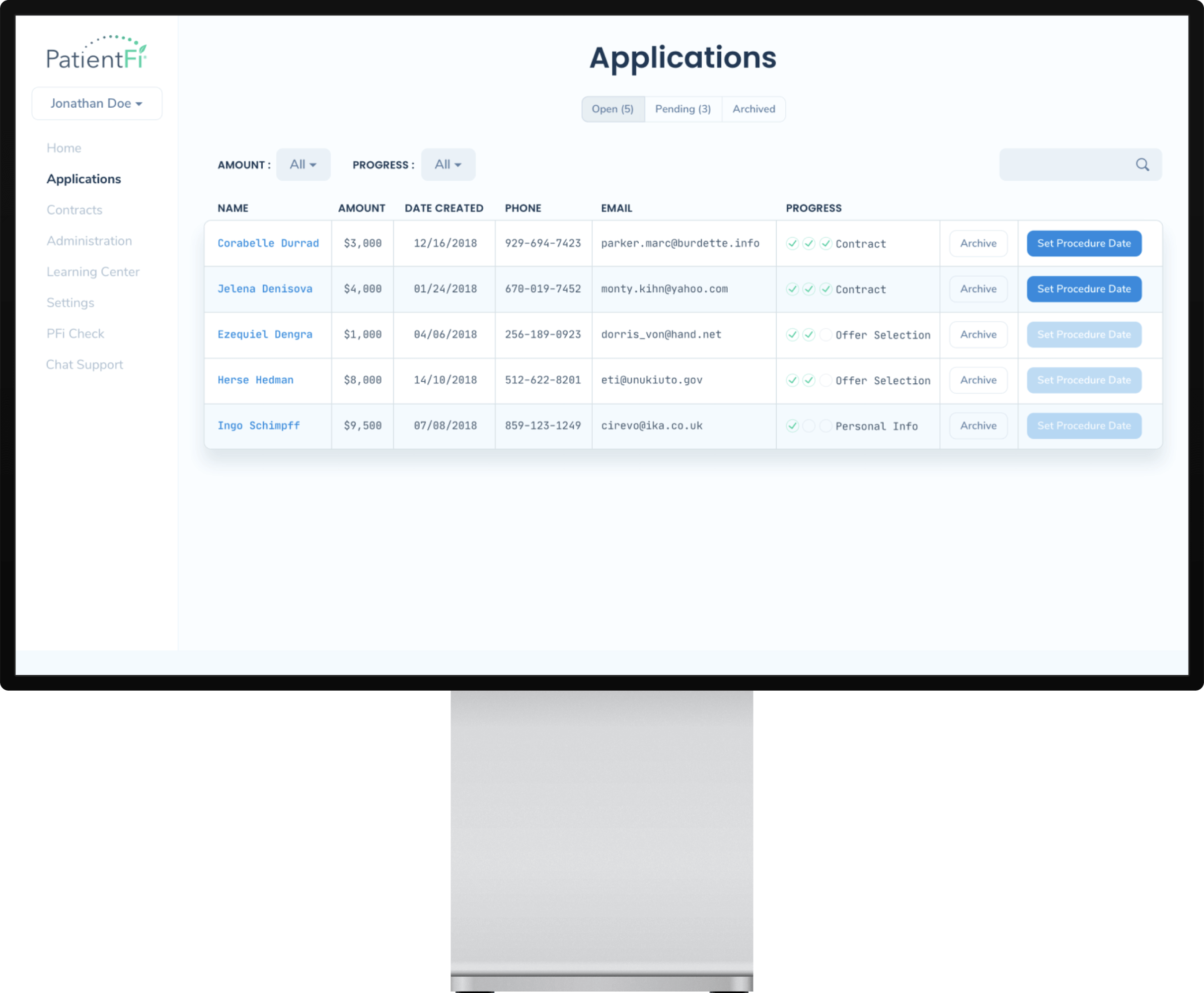
The Complete Solution for Patient Financing Management
A centralized platform to manage patient financing where everything is within a couple of clicks with a simple-to-use UX, enabling the Provider staff to use the platform without prior training. In addition, the platform eliminates the need for paper trails and allows remote access to the management system.

Perfectly Balanced and Accessible
The UI elements in PatientFi have been designed with contrast and hierarchy in mind to make it easy for users to navigate. Neutral colors with accents and typography differences are used to highlight the hierarchy of elements. This helps to ensure that the platform is visually accessible and easy to use, especially for users who will be spending a lot of time on the platform.

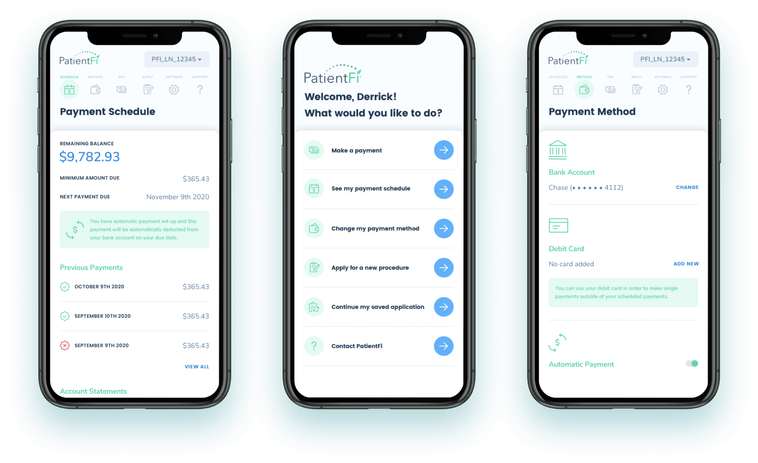
Seamless payment management app for Patients
With the Mobile Web App, patients can easily apply for financing and track the status of their applications on their devices. These can be particularly helpful for patients who cannot visit a healthcare provider's office in person or prefer online transactions. In addition, a web app enables real-time updates and notifications, informing patients about their financing status and helping them make timely decisions about upcoming treatments.